A Five-Minute Tour of an Unfamiliar Interface
A five-minute tour of an unfamiliar interface helps you read labels, visual groups and actions before choosing a route or committing to a consequential control.
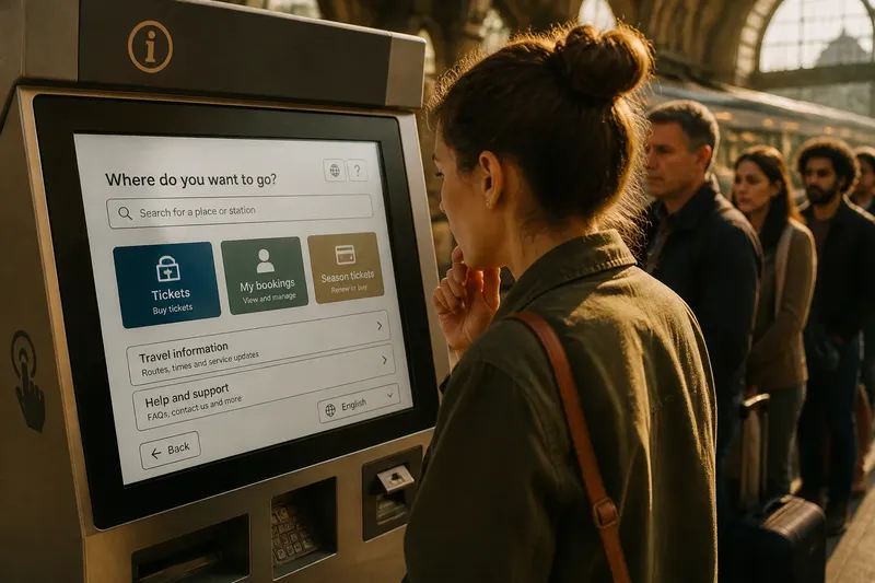
You open a ticket machine at a station you do not know, while a queue gathers behind you. A five-minute tour of an unfamiliar interface gives you a defined pause to read its labels, notice how the screen groups information and find the available actions before choosing a route.
The time is divided into five brief passes, each with a different purpose. You do not need to inspect every corner or make a selection; the aim is to distinguish what the screen presents from what you might otherwise assume.
Read the labels
Begin with the screen title, section names, button labels, instructions and small notes near the edges. These words reveal the interface’s categories, which may differ from the terms you would use yourself.
Notice whether a control names an action, a destination or a result. “Search” describes an action; “Tickets” may open a destination; “My bookings” suggests material associated with an account or previous choices. Those labels point to different kinds of next screens.
Verbs and qualifiers can narrow a choice. “Continue” needs the nearby prompt to explain what continues. “Save draft” is more specific than “Save”, while “Apply” may refer to a selection that is not yet active. Scan for small phrases such as “for this device”, “until you sign out” or “edit later”: they can clarify the scope, timing or reversibility of an action.
Read visual groups
Headings, spacing, borders and colour imply relationships. A heading above several controls usually gathers them into a section; a line or block of colour may separate one task from another. Check which label sits closest to a text box, and whether a note appears to apply to one field or a whole group.
Repeated patterns offer useful clues. If several rows each show a title, a short description and an arrow, they may open related detail views. A row that breaks the pattern might instead report a status. Treat repetition as a clue, not proof, and check the wording too.
A filled button may have greater visual emphasis than a plain link. That emphasis tells you what the designer wants noticed first, not whether it suits your purpose. Read the label before treating the most prominent control as an instruction.
Locate available actions
Scan for ways to proceed, change course or leave: buttons, links, tabs, menus, back arrows, close icons and expandable rows. Look at the lower edge of the screen as well as its centre; scrolling may reveal more controls.
Separate actions from status indicators. A muted button may depend on a field or choice that is not complete; a coloured badge may simply report a condition. Icons can be ambiguous without text. A magnifying glass often suggests search, but its meaning still depends on the surrounding screen.
“Cancel”, “Back”, “Not now” and a close control may lead to different outcomes. A back arrow commonly returns to a previous view; a close icon may dismiss a panel or interrupt a task. If that distinction matters, read any confirmation prompt before proceeding. For purchases, accounts or personal information, pause if the consequence is unclear rather than assuming the most prominent option is the safest.
Questions about screens?
What does a highlighted button mean?
Highlighting usually marks visual priority, not a recommendation tailored to you. Read the button label and nearby prompt to understand the action it describes.
How can I tell if something is clickable?
Look for familiar button shapes, underlined text, focus changes where available, or patterns repeated elsewhere on the screen. If the cue remains unclear and a tap could submit, delete or purchase something, do not test it casually.
Why do some options appear disabled?
A muted control may depend on a field or choice that is incomplete, or it may not be available in the current view. Nearby instructions may explain what is needed; its appearance alone does not tell you that it is broken.
What should I do if a label is vague?
Read the neighbouring heading, explanatory text and any preview of the next action. If the consequence remains unclear, choose a plainly labelled alternative or seek help before committing.
Spend five minutes
Use one minute for each pass. This simple allocation keeps the tour bounded and gives you time to look without turning the first encounter into a hunt for every feature.
- First glance, one minute: Read the screen title and any sentence naming the current task. Decide whether the page appears to match what you came to do; if not, look for a clearly labelled route back or to another section.
- Label pass, one minute: Scan buttons, tabs and field names for actions, destinations and limits. If a label is vague, read its nearby explanation; if the consequence remains unclear, defer that control.
- Grouping pass, one minute: Notice headings, spacing, borders and repeated rows. If a note sits close to one field, treat it as relevant to that field; if its scope is uncertain, check the surrounding group before acting.
- Action pass, one minute: Locate the main control, quieter alternatives, back or close options, and disabled controls. If an action is consequential or its meaning unclear, leave it untouched; otherwise, compare its label with your task.
- Decision pause, one minute: State what the intended control appears to do and what you expect to see next. If the expected result follows from the screen’s wording, decide whether to proceed; if not, pause and seek clearer information.
Say you have opened an unfamiliar library catalogue on a tablet and want to reserve a book. The page title says “Discover”, the screen offers a search field, a “Browse” tab and a prominent “Sign in” button, and the five-minute tour begins. In the first pass, you decide the page is for finding material. In the label pass, you notice that “Browse” is a separate route, not a search filter. In the grouping pass, each listing places the title, location and availability together. In the action pass, you find “Place hold” on a book’s detail view and see that signing in comes first. At the decision pause, you understand that a hold requires sign-in, so you can either proceed to that clearly labelled route or leave the reservation for later; you do not mistake “Continue” for a promise that the hold is already placed.
A kiosk may call for a quick scan of its main screen and physical prompts; a banking or health portal merits closer attention before a sensitive action. On a public display, the useful distinction may be whether a message is an instruction, a status update or an advertisement. In each setting, check the screen’s labels, groupings and available actions against the task in front of you.
Leave menus closed
It is not worth opening every menu, testing every icon or memorising the whole interface before beginning. That adds delay, and an exploratory tap may trigger an action you did not intend. Keep the tour focused on the current screen and the choices that bear on your task.
If the screen changes after a selection, look again rather than carrying earlier assumptions forward. New labels, reordered groups or a confirmation prompt may change what is available. A five-minute tour of an unfamiliar interface is most useful when it leaves you with a clear next decision: act on what the screen actually says, or pause where its meaning remains uncertain.