How Intertitles Carried Speech and Story in Silent Cinema
Intertitles in silent cinema carried dialogue and story between images. Learn how wording, placement and design guided attention and shaped what viewers understood.
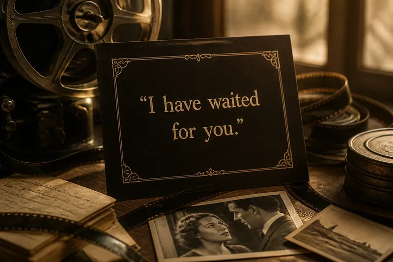
A dark card appears between two shots: “I have waited for you.” The image gives way to words, then returns to a face that may be relieved, wary or unreadable. Intertitles in silent cinema did more than substitute for spoken dialogue. They shaped the rhythm of looking, supplied information the images could not easily convey, and gave printed language a place inside the film’s visual world.
Intertitle basics
An intertitle is a written card inserted into a film, commonly between shots or scenes. In silent cinema, it could present dialogue, identify a speaker, establish a place or time, explain an event, or provide a short narrative passage. The card appeared on screen as part of the projected film rather than as writing added beside it by a modern player.
The term distinguishes these cards from titles that appeared before a film began or introduced its cast and production details. It also distinguishes them from subtitles, which are ordinarily placed over moving images to translate or transcribe speech. Intertitles interrupted the image to give words their own screen space.
That interruption was meaningful. A card could pause the action while the audience read, then return to an image altered by the information. In other cases, it could make an otherwise difficult scene legible: a letter might be shown in close-up, followed by a card reproducing its contents. The words were not simply an accessory to the image; they were one of the film’s storytelling materials.
Why written cards mattered
Silent films had no synchronised spoken dialogue, but they were not necessarily shown in silence. Live musicians, narrators and other arrangements could accompany a screening, depending on its venue and circumstances. Such accompaniment did not provide a uniform stream of spoken lines. Intertitles offered a visible, repeatable way to communicate language and essential narrative information.
Gesture and expression could convey intention, conflict and emotion, but they could not always make a precise name, promise, threat or change of plan clear. A character might hand over a folded letter; the card could give the audience the words on the page. An intertitle could also locate an action, explain a jump in time or identify a relationship that the images left uncertain.
Writers and filmmakers therefore faced a choice: what needed to be stated, and what could remain visible but unspoken? Too much text could slow the film and explain what the acting already made clear. Too little could leave viewers unsure about a motive or a plot turn. A useful card gave the audience information that changed how the next image was understood.
Dialogue card timing
A dialogue intertitle presented a character’s words as text, often with the speaker identified by a name, a portrait or the preceding action. The film could show the character, cut to the card, then return to a reaction. The audience read the line in the pause, while the actor’s face supplied the emotional response that print alone could not show.
Some cards framed a line as direct speech; others used a more literary presentation, with quotation marks or an attribution. The conventions varied. What mattered was whether viewers could tell who was speaking and how the words related to the adjacent images. A line placed before a reaction could invite one reading; the same line shown after the reaction could feel like a recollection or an explanation.
Dialogue cards were selective. A film did not need to transcribe every imagined conversation. It could give the audience a sharp exchange, then let gestures and movement carry the rest. This economy made the written line conspicuous: a card tended to mark a moment when exact wording mattered.
Narrative card roles
Narrative intertitles, sometimes called expository or descriptive titles, supplied information outside a character’s spoken words. They might announce a change of location, establish how much time had passed, explain a family connection or describe an event that could not be shown economically. Rather than pretending to be speech, they spoke in the film’s own narrative voice.
The distinction is useful but not absolute. A card could blend narration with a character’s thoughts, or present a written document whose words belonged to someone in the story. The card’s wording and placement helped signal its role. A heading such as “Three years later” reads as a time marker; a note beginning “My dear sister” is likely part of a letter.
Narrative cards could make a story easier to follow, but they also shaped its authority. When a card stated a motive or explained an event, it directed the audience towards a particular interpretation. When the film withheld that explanation, viewers had more work to do, reading the images for clues. The decision was not merely how much text to include; it was how much the film should tell and how much it should leave open.
Card placement and point of view
Placement depended on what the words needed to do. A card at the start could establish the setting or situation before the action began. One between shots could interrupt a scene to deliver a line, then send attention back to a face or gesture. A card after an event could explain its consequence or reveal information the audience had not yet been given.
Some films used cards to show text that characters encountered, such as a letter, telegram or sign. Others kept those objects within the image and used a separate card for the readable wording. The difference affects the scene: a document presented as an object belongs to the character’s world, while a standalone intertitle can feel like an address to the audience.
When viewing a surviving silent film, notice not only what a card says but what surrounds it. Does the next shot confirm its claim, complicate it or contradict it? Does a character’s reaction arrive before or after the words? These relationships reveal how the film choreographs reading and looking together.
Intertitle design choices
An intertitle had to be read on a projected screen, often in a room where viewing conditions differed from one venue to another. Designers could use a plain background and legible lettering, or add borders, ornament, illustrations and distinctive lettering to suit the film’s tone. The card’s visual style could set it apart from the photographed action while still belonging to the film’s overall design.
Lettering, spacing and line breaks affected readability. A compact sentence could be grasped quickly; dense wording required more time and attention. Decorative type might evoke a formal document or a particular mood, but ornament that obscured letter shapes could make the card harder to read. The design was a practical part of storytelling, not merely a frame around the words.
Cards also varied in how they named speakers and separated dialogue from narration. A portrait or label could reduce ambiguity, while a consistent style could help viewers recognise recurring kinds of text. These cues mattered because the audience needed to understand not just the sentence, but who or what was speaking.
What do viewers ask?
Were all silent films full of intertitles?
No. Their number and function varied between films and across different kinds of storytelling. Some relied heavily on written explanation, while others used cards more sparingly and allowed images, gestures and performance to carry more of the narrative.
Did intertitles show dialogue exactly as spoken?
They represented selected dialogue, not necessarily every line a character might have said. A card could condense an exchange, present a key sentence or make a plot point explicit, leaving the surrounding conversation to be inferred from the action.
Why do intertitles look different?
Design choices could distinguish dialogue, narration or documents within the story, and surviving copies may also reflect translation or later restoration. Differences in lettering, layout and wording are worth noticing, but they do not by themselves identify when or why a card changed.
Can intertitles be read like subtitles?
They can be translated or accompanied by subtitles, but the experience is not identical. An intertitle replaces the moving image for a moment, giving the text a separate beat; subtitles usually share the screen with the action.
Reading cards closely
Start with a simple question: what does this card tell you that the preceding image did not? Then watch the first image after it. The response may confirm the wording, reveal a character’s private reaction or expose a gap between what someone says and what they do. That sequence is often more revealing than reading the sentence alone.
Say you are watching an invented scene in which a character leaves a station holding an unopened envelope. An intertitle reads, “Your brother will arrive tonight,” and the next shot shows the character looking towards the platform rather than opening the letter. The card supplies the message; the following image makes waiting, rather than reading, the scene’s immediate concern. The words redirect attention without explaining every feeling.
It is not worth pausing over every decorative detail or trying to assign a fixed meaning to each typeface. Look instead for choices that change comprehension: a line break that emphasises a word, a speaker label that alters attribution, or a card placed where the story’s time or point of view shifts. Those observations keep attention on the film’s choices rather than turning the intertitle into a puzzle detached from its scene.
Intertitles in silent cinema made written language part of the sequence of images: a card could speak for a character, orient the audience or leave a question hanging. Read one, then watch the return to the scene. The difference between what the words state and what the image shows is often where the film’s most useful clue lies.